Creating a color palette for your home is one thing, but extending those colors to your sunroom where you will have a completely different type of lighting, look, and feel, is another. How can you create a casual ambiance that brings in elements of the outdoors? Read on for some ideas sure to provide you with inspiration for further thought.
Painted Brick
Since one wall of your sunroom is likely the wall of your home, consider painting the brick a warm light grey to lighten up the room much better than having a dark-colored red, brown or blue brick wall. The natural texture will really offset the overall look as well, creating a myriad of surfaces to catch the light. It is also a great compromise between natural and white brick.
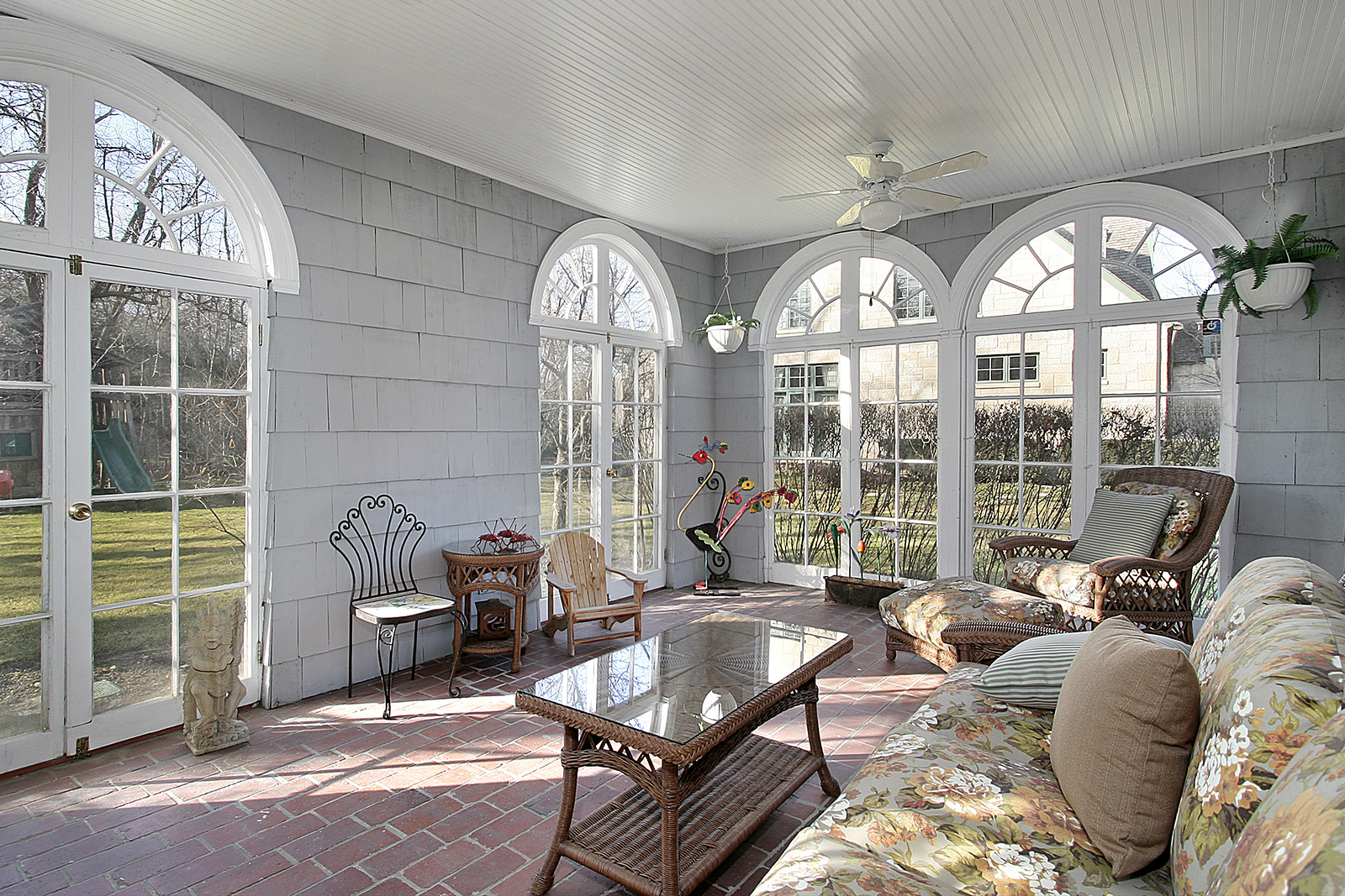
Photo by pics721 on Shutterstock


Bright and Sunny
Bold and bright colors, when balanced with pale neutrals, can really make your sunroom sing. Aqua, grass green, sandy yellow, and coral can all work together to create a summery and relaxed feel. Somber colors have no place in a sunroom, so by pulling together several of these cheery colors, you can create a space that feels like you’re extending the spring and summer season all year around. Add some accent pillows for an additional burst of color. Instead of using white trim on windows, consider doing a self-trim of the same color as the wall. Trim applied as the same color of the wall can keep the space from looking small and tight while allowing the eye to flow through to the outdoors. Spray paint an old rocking chair in a bright shade or bring in a rustic or reclaimed wooden table to complete a lived-in look that is still classy.
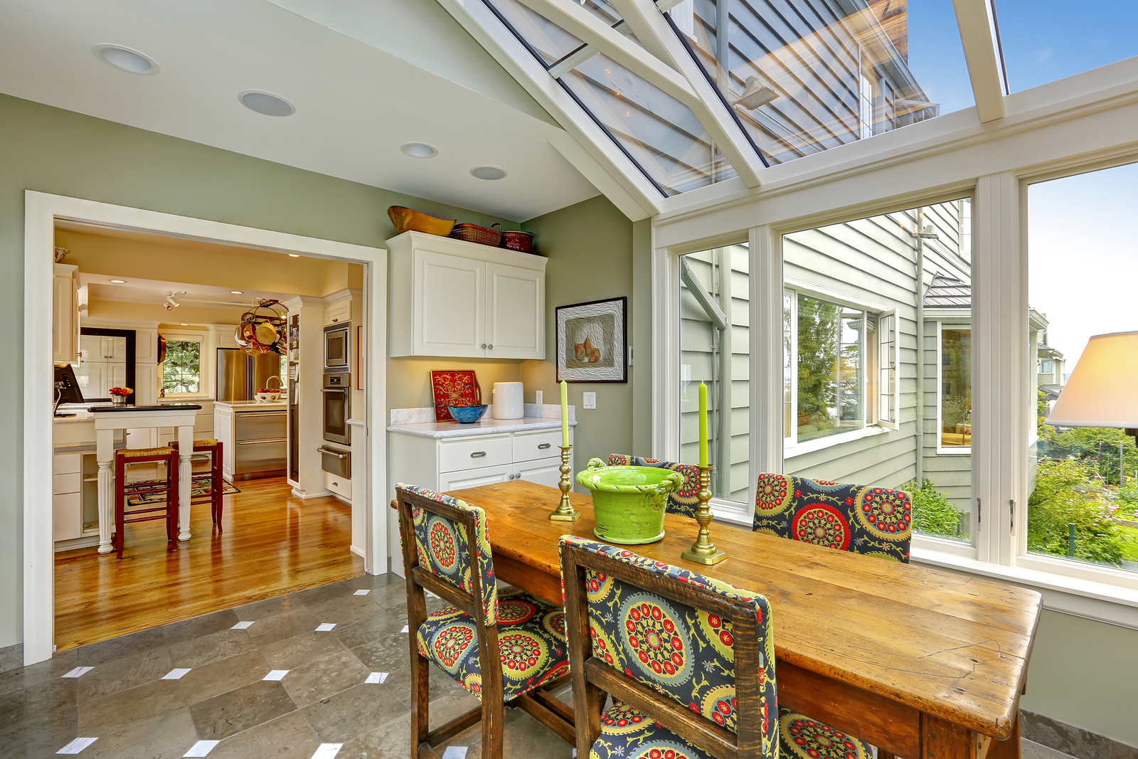
Photo by Iriana Shiyan on Adobe Stock
Just Add Texture
A variety of textures in basic colors on a backdrop of brighter shades can add a great deal of interest. This works particularly well with strong shades such as blues or corals, where intricate items such as woven mats can be used on the floor or nailed to the wall as a backdrop for off-white medallions or other attention grabbing items. Consider changing up between a semi-gloss paint and more flat seeming items that don’t have the same level of gloss as the walls, which can really make conversation pieces stand out.

Photo by Kamusal Alan on Pxhere
Bare Naked Walls
If you have a great deal of exposed wood, stone or brick in your sunroom, why not go for an accent wall that is a bit more interesting in color as a contrast? While painting the entire room in a deeper shade might make it feel smaller or dark, having just one wall painted could serve to create an interesting contrast. Lighter furniture and decorations would help offset and keep the room from feeling too heavy.
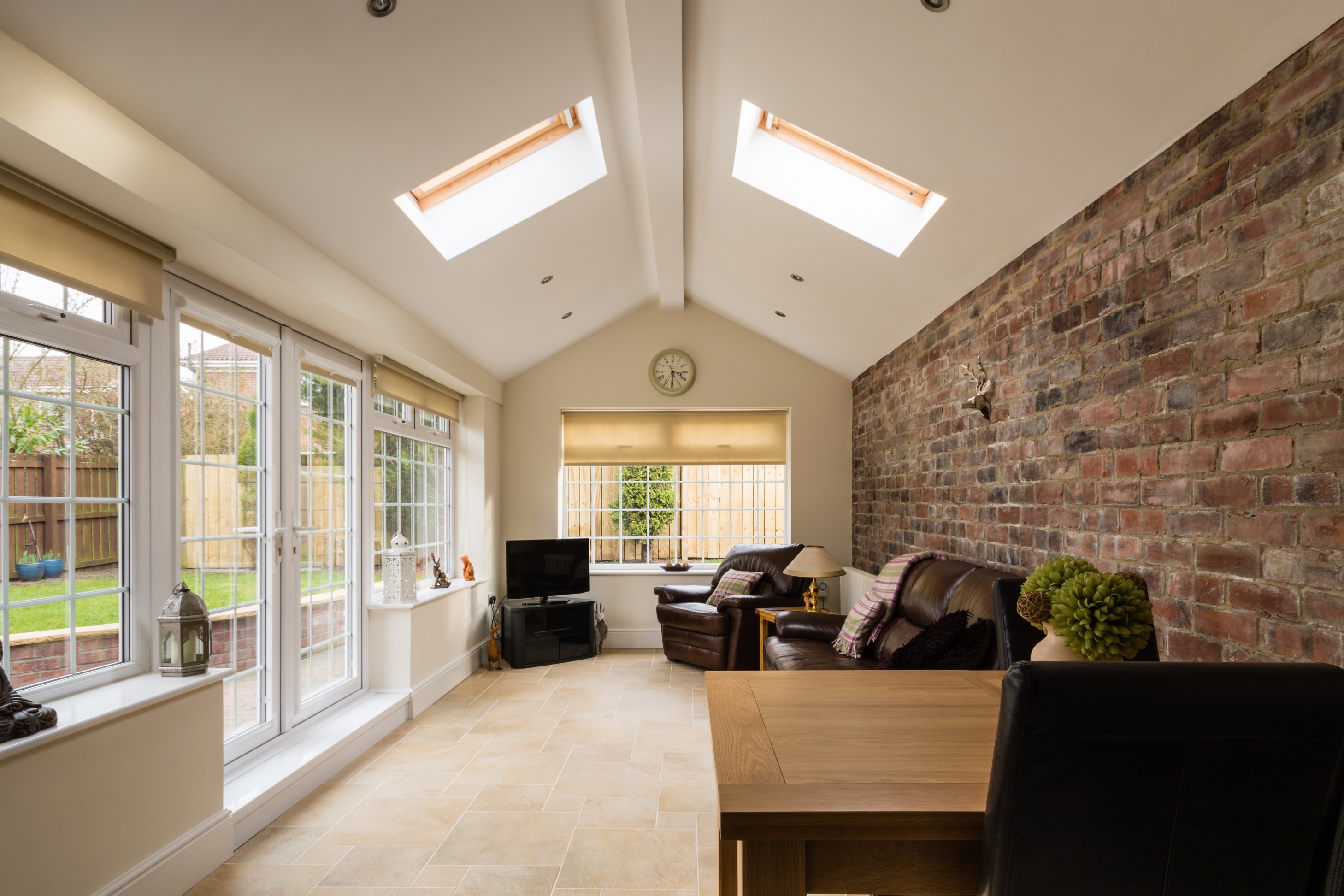
Photo by drhfoto on Adobe Stock
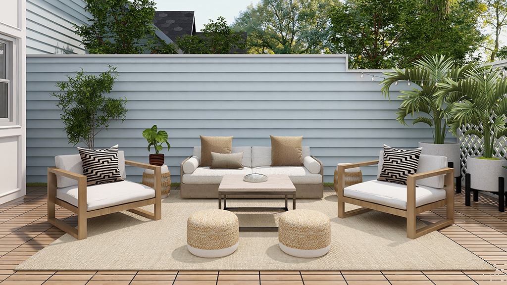
Relaxing Retreat
If you look forward to your sunroom as place to relax, recharge, and rest up from a hectic day, the bright and bold colors may feel overwhelming. Instead, go for a more muted look that can extend the feel of your home beyond the back door. Light grey accents and white trim form a beautiful and restful backdrop for deeper green or brown walls, providing that balance that is needed in the room. Wicker and iron furniture are comfortable and sturdy for casual gatherings.
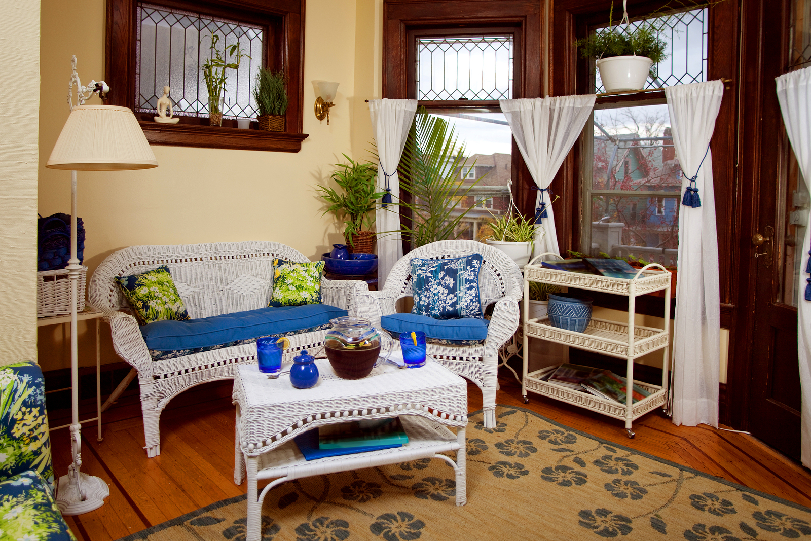
Photo by Nicholas Piccillo on Adobe Stock
Nature Lovers
Bringing the outside in can often best be accomplished with natural colors and textures – maybe a raw brick floor and walls, with lighter tan walls and white trim. The color can be provided by flowering plants or accent pillows in tangerine or spring green, with tall windows that open directly to your garden. Conversation will flow when you add in a comfy couch and chair with low tables for drinks or snacks.
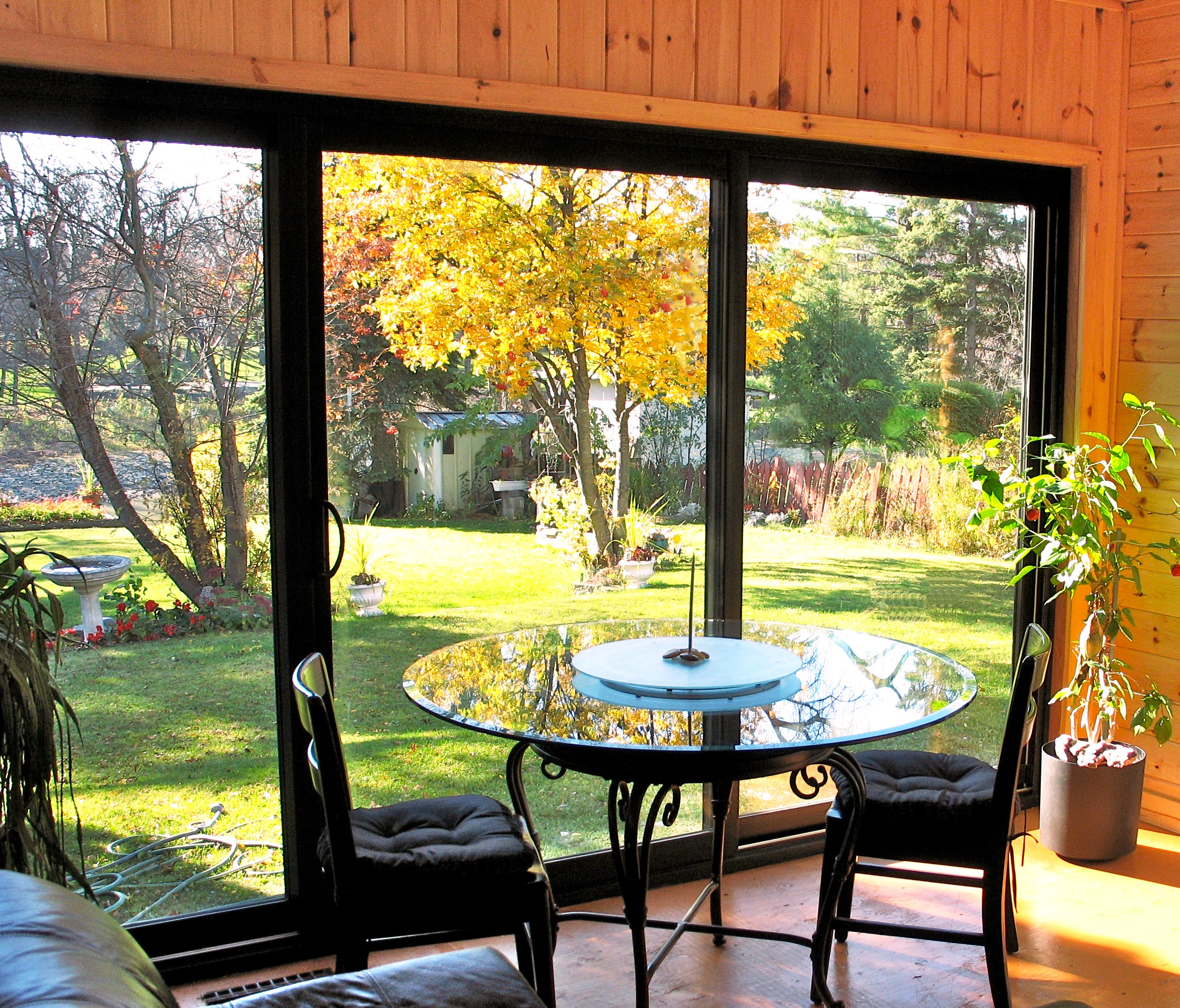
Photo by geewhiz on Bigstockphoto
Your sunroom should be a reflection of your tastes and how you will be using the room. If you are in a warm climate and able to spend all seasons enjoying the sunroom, you may want to go with brighter colors; while those needing relaxation after a tough week may lean in the direction of more muted colors.