


Without visually interesting interior color schemes that include contrasts, your home’s interior design can look flat and uninteresting. But in contrast (if you’ll pardon the pun), you can create a lasting impression by using color contrasting techniques in your room styling. The following tips will show you six different ways you can apply contrasting color techniques in your home’s interior design.
But before we get into the tips, we first have to make sure we’re up to speed with some “Interior Design 101” terminology. Color contrasting is the juxtaposition or closeness of two or more differing colors that call attention to the dimensions and furnishings of a room. To use this technique, you must first consider your primary, secondary, and tertiary colors. Primary colors like blue, red, and yellow, are colors that can’t be created by other colors. Secondary colors, like green, orange and purple, are created by the mixing of primary colors. Tertiary colors are shades and hues created by the mixing of primary and secondary colors.

Photo by Albachiaraa on Shutterstock
It may sound complicated, but it really isn’t. We confidently experimented with different crayon colors when we were kids, but as adults, we can use a color wheel like the one above to show us complementary opposing colors to help us decide what hues to use in a room. (Tip: Click here to download a high-resolution version of our color wheel that you can print.)
So, to create visually arresting color contrasts in your home, consider using two to four colors per room. And don’t just focus on the colors of your walls. Remember that you can incorporate contrasting color schemes with your furniture, furnishings, and other elements of your home décor too.
1. Contrasting with Light and Dark Colors
You can easily use light and dark colors to play around with the visual theme of a room.
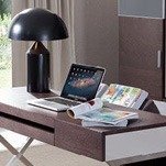
Any non-white color themes can be contrasted with lighter colors. Conversely, any all-light color themes can be darkened with the right dark color contrast.
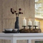
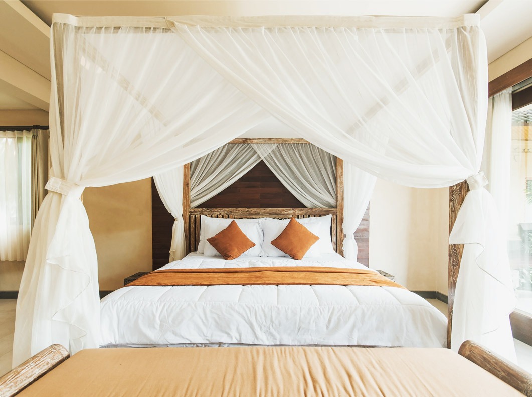
2. Contrasting Cool and Warm Colors
This color scheme strategy is all about interior design balance.

Photo by Michelle_Raponi on Pixabay
Warm colors, like orange or yellow, make a room look cozier, while cool colors, like blue or teal, can make small rooms look larger. Decide what color you want dominating in this contrast to make your room look larger or cozier.
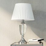
3. Contrasting Complementary Colors
These are opposing, yet visually complementary colors that you can find on a color wheel.

Photo by deanmoriarty44 on Shutterstock
For example, purple and yellow or green and red are complementary colors. You can use complementary colors to make rooms visually pop.
4. Contrasting Triadic Color Schemes
Triadic color contrast schemes make for lively and bold interior designs. This is a great color contrast for recreational rooms, rooms for children or experimentation.

Photo by jarmoluk on Pixabay
But be careful to only use a single triadic color scheme in your interior design because multiple triadic color schemes create visual chaos.
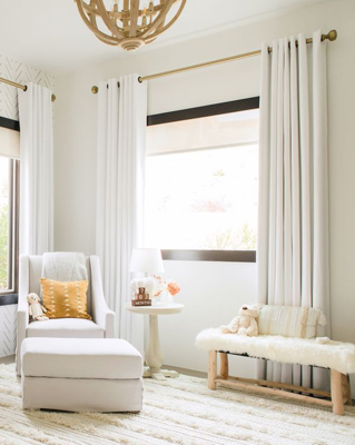
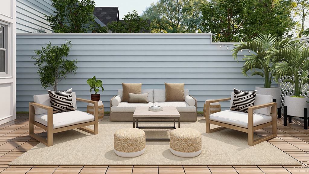
5. Contrasting Monochromatic Color Schemes
Monochromatic color schemes are derived from a single base hue that’s extended by using its different shades, tones, and tints. Different tints of the main color can be created by adding white, and the shades and tones can be made by adding a darker color, gray, or black to the main color.

Photo by enginakyurt on Shutterstock
Monochromatic color schemes provide opportunities in interior designs because they allow for a greater range of contrasting tones to attract attention and create focus. The use of a monochromatic color provides a strong sense of visual cohesion. The relative absence of hue contrast can be offset by variations in tone and by adding different textures and patterns. Which leads to my final tip…
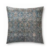
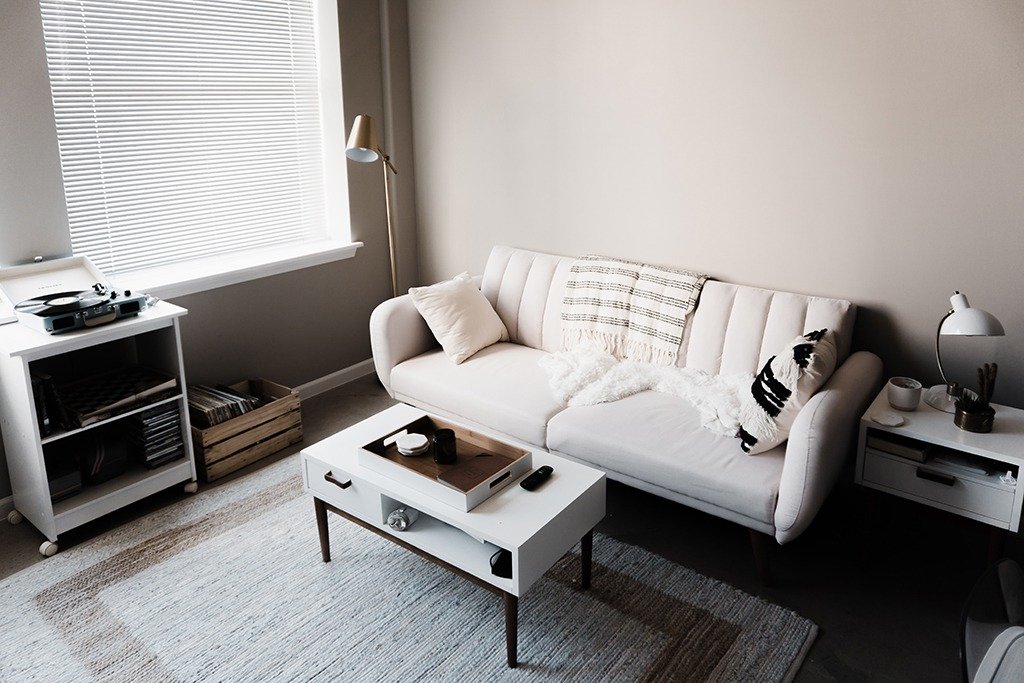
6. Contrasting Colors with Patterns
You can also contrast colors with a pattern of your choosing.

Photo by StockSnap on Shutterstock
It can create a sense of artistic dynamism in your room’s visual theme.
When it comes to contrasting colors, the possibilities are endless. Creatively color contrasting your home’s interiors doesn’t have to be a chore, and you don’t have to be an interior design expert to do it. Start slow, do some color wheel homework, and have fun with it.

