Chances are, you have heard all about Pantone’s annual Color of the Year pick. This global color authority conducts extensive trend research to arrive at its standout choice, and the color selection consistently becomes one of the most influential shades across interior design, fashion, pop culture, and beyond. The Pantone Color of the Year 2019 is Living Coral, a vibrant pink-toned orange that easily adds a powerful pop of color to any space in the home.

Pantone’s Color of the Year 2019 is Living Coral. The lively paint color works well with neutrals – but is phenomenal to use with throw pillows, blankets, and more accessories. Image via Furniture Choice UK.
But did you know that most major paint brands and home improvement companies release Color of the Year selections of their own?
For example, Benjamin Moore has debuted a striking neutral gray called Metropolitan for its 2019 trend choice, while Dutch Boy Paints has selected a spring-ready color named Garden Green, and Sherwin Williams is ringing in 2019 by unveiling a warm terracotta shade called Cavern Clay. And that’s just the tip of the iceberg!
Each of these companies also releases an annual set of color palettes that are all neatly tied back to their Color of the Year trend shade. The brands put together extensive packs of complementary and contrasting color options that take a lot of guesswork out of your at-home decorating. It’s like having a personal interior designer helping you select foolproof color schemes to work with.

Dutch Boy’s Color of the Year 2019 selection is called Garden Green. Use it with light accessories and natural woods for major impact. Image via Dutch Boy Paints
If you are a design-savvy home decorator who loves to keep up with the latest trends, it can still be a little confusing (and even daunting) to know which color trend forecasts work best for your own lifestyle.
To give us some suggestions on how to easily work trending hues into your décor, House Tipster spoke exclusively with an expert: Patti Carpenter, Trendscope Color and Trend Specialist.
Should You Paint Your Home with the Color of the Year 2019?
First of all, Carpenter stressed that you absolutely should not go along with trends you don’t even like simply because they’re fashionable. It is also highly unlikely you’ll be repainting your home every year to match a Color of the Year selection, so you want to choose wisely.
“Paint your home the color that resonates with you and makes you happy to be home,” Carpenter advised. “It should be something you want to keep for awhile.”

Behr’s Color of the Year 2019 selection is a statement-making shade called Blueprint. It’s perfect to mix with other blue shades. Image via Behr Paint.
“As a customer, see if these colors have meaning for you: and if they don’t, discard them,” Carpenter added. “These are tools assisting you toward one color or another. You shouldn’t chase the trends if they don’t resonate with you.”
Remember: you’ve got to live with these colors on your walls – so consider if you really love Living Coral or Blueprint before committing your entire dining room to the daring hues.
To dip a toe into painting with a trending color, try using the shade as an accent wall, on your ceiling, or to separate spaces in an open-concept floor plan.

Dulux’s Color of the Year 2019, Spiced Honey, certainly packs a punch. Use the warm amber shade on a small ceiling to add drama to an otherwise light space. Image via Dulux.
Accessorize with the Color of the Year 2019
Even if you’re not painting, it is exciting and fun to refresh your rooms with the latest and greatest the design industry has to offer. You can get in on the trends you love without spending a ton of money and overhauling your entire space.
“If you are a forward-thinking person who wants to take advantage of knowing what the trends are and bringing that into your space, incorporate a print that may have that color in it, along with colors that speak to you,” Carpenter said. “Change your sheets or your bedding – that’s not a huge cost. Freshen up your artwork, bring in a new table arrangement or vase to your coffee table or bathroom.”

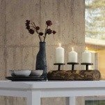
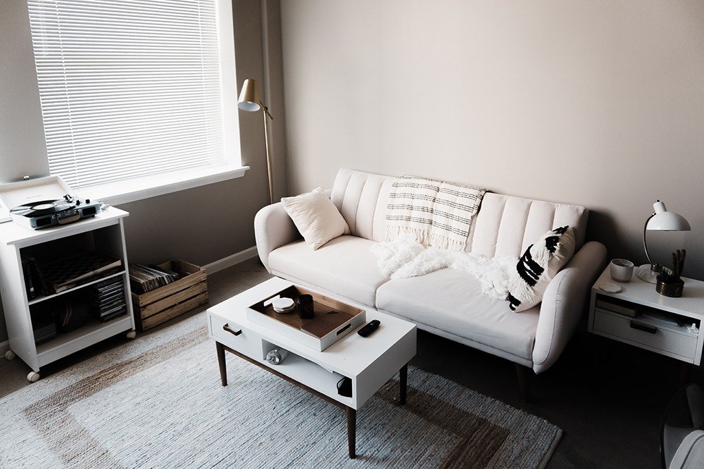
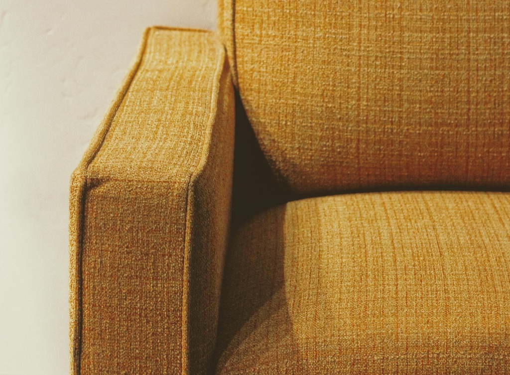
Benjamin Moore’s light gray Color of the Year 2019, Metropolitan, works well as furniture, in decorative accessories, and of course, as a neutral to pop other wall colors.
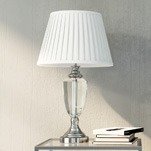
One of Carpenter’s favorite ways to add bold color to a space with very little commitment is through colorful or patterned lampshades. These lighting accessories are an oft-forgotten detail, and they don’t have to always be plain white.
“[Refreshing lampshades doesn’t] have to cost a lot of money, but can really add a pop of color to your space,” she said.
No matter what you do with your décor, Carpenter has a simple suggestion to keep in mind.
“It needs to bring a smile to your space, and resonate with those who come into your space – beyond showing people you have your finger on the pulse,” she said.