Bold colors often are used in contemporary home design. Punches of bright or deep tones can accent neutral palettes of white, cream, beige, gray, or black, enlivening your room décor.
This color technique, however, must be used with a bit of finesse in your home decoration. It’s a bit like a dancer leaping and pirouetting atop a cliff. One wrong move, and the dancer can leap right over the edge to the rocks below.
In the case of home décor, the dancer is color. The cliff’s edge is a color mistake. And the rocks below are where Garish resides. (Think of Garish as a troll-like character who lives to destroy the beauty of your interior décor.)
The dictionary defines “garish” in several ways, including excessively bright or glaring and overly elaborate. The most important definition for our purposes, however, is “tastelessly colorful.”
Now let’s define one more word before we go on: bold. In terms of interior design color, bold means a color that’s striking, conspicuous to the eye, flashy, or showy. Such a color can be anything from screamingly bright neon to girly pastel. Basically, if it’s in your face, it’s bold.

Photo by archideaphoto on Shutterstock


Thus armed with our terms, it’s time to sally forth with bold colors. To avoid falling into the clutches of Garish, in the Land of Tastelessly Colorful, keep away from the cliff by avoiding these seven bold color mistakes.
Mistake One: Too Much Of One Bold Color
No matter how much you may love a color, if it’s not a neutral like the colors mentioned above, it has no business dominating your room.
If you want a lot of a power color, like purple, in your room design, you must give it a neutral to play with.
Mistake Two: Bold Family Members Who Don’t Get Along
Just because two people are family doesn’t mean they want to hang out with each other. (I’m sure you have a family memory or two to support this fact.)
Bold colors in your home decoration are the same way. In the family of the color red, for example, there are hundreds of relatives. When you put red in your décor, you need to be sure the reds aren’t so different that they clash.
In the photo above, the deeper red tones of the window treatments, the sticks, and the glass balls are at odds with the brighter red table mat.
The bold family member conflict can be even more egregious when the colors also have a pattern.

Photo by VOJTa Herout on Shutterstock
Even without the pattern in the wallpaper and bedcoverings above, the combination of deep lavender and wine collide unpleasantly. They also make the next mistake.
Mistake Three: Pairing Jewel Tones & Pastels
Jewel tones, the saturated colors that are often found in gems, deeper colors like purple, emerald green, sapphire blue, and deep red, do not play well with pastel colors like lavender, pink, or the light versions of other colors like blue, yellow, or green.
As with the lavender/wine mismatch in the previous section, the pink pillow above and the lighter tones on the box hand the décor over to Garish. (It also doesn’t help that the whimsical Winnie the Pooh box clashes with the room design.)
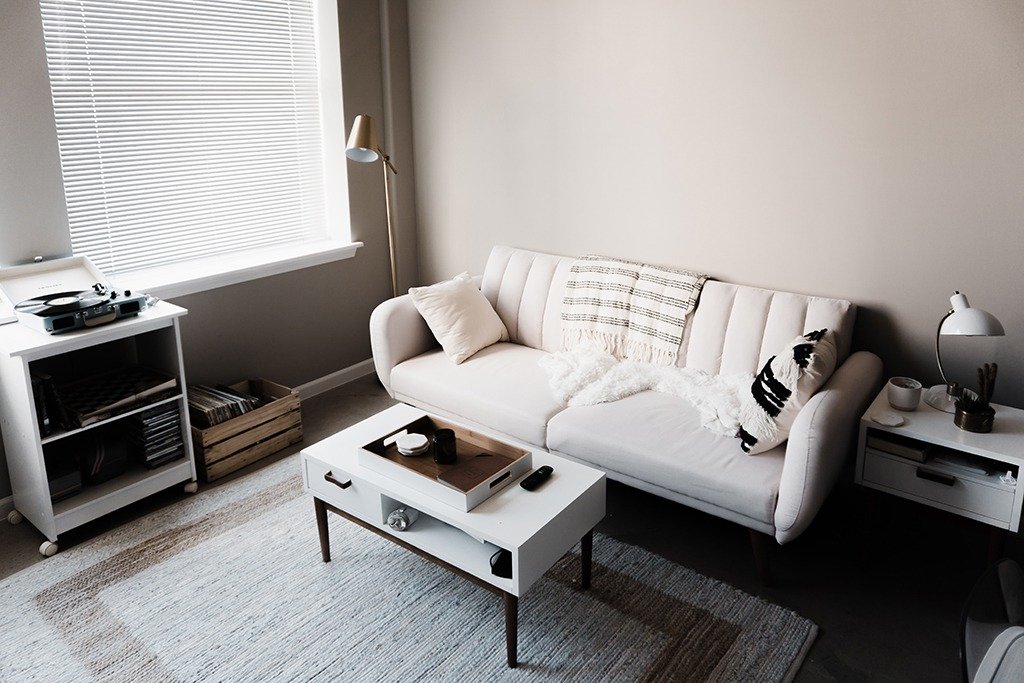
Mistake Four: Not Enough Contrast Between Bolds
Even if you choose your bold colors from two different families so you don’t have to worry about the tone mismatch in Mistake Two, you can still make a bold mistake. Think of good friends who have too much in common, so much so that they drive each other crazy.
In the photo above, purple is in a different family than maroon, but the two tones are far too close to each other to pair well.
When there’s not enough contrast between colors, instead of elevating each other, they will detract from each other.
In the photo above, although the blanket has blue and red tones that match the décor, the bright yellow is too close but not close enough to the mustardy beige of the window coverings. The result is in Garish’s clutches.
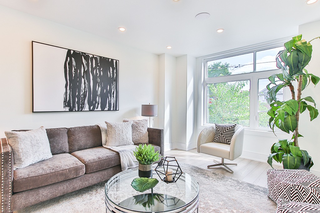
Mistake Five: Too Many But Not Enough
When you use enough bold colors together, they can morph into something that becomes almost a new color: rainbow.
The knitted blanket in progress above is one I’m working on that uses scrap yarn from other projects. So far, I’ve included at least a dozen different colors. In pairs or threesomes, these colors wouldn’t work. But blended, they become a singular color impression that is eye-pleasing.
The same thing can be done in a room.

Photo by Artazum on Shutterstock
The general rule of thumb with this sort of décor is to include at least four bold colors in the room’s palette. This isn’t a hard and fast number. Use whatever number it takes to get that sense of color fusion you see above.
Mistake Six: Multiple Bolds Without a Neutral
The room in the photo above also works because the bright colors have a neutral playground. Bold tones can play an even more dominant role than they do above, if they have a neutral wall color behind them.

Photo by archideaphoto on Shutterstock
Without a neutral nanny to keep colors in line, a bold room will lose its way.

Photo by Artazum on Shutterstock
Mistake Seven: The Lonely Bold One
Once upon a time, there was a sad bold color. The color was sad because he was all alone.

Photo by Artazum on Shutterstock
Do you see the sad color in the photo above? Here’s a hint: It’s in the window coverings. Although the room has multiple bold tones, the turquoise is hanging solo.
Bold colors need friends. In other words, when you bring in one bright bold color into the room, you need some other element in the room that is similar or you will end up with Garish.

Photo by Interior Design on Shutterstock
Avoid making the seven mistakes above, and you can keep your rooms out of the hands of Garish. Armed with an understanding of what to do and what not to do with bold color, your interior décor can dance happily ever after.
Have you made any bold mistakes in home design you later corrected? Or have you had some bold successes? Share with others to rescue them from the Land of Tastelessly Colorful.